Unlocking the Secrets of Scatterplots: A StatCrunch Adventure
Imagine you're a detective, but instead of solving crimes, you're solving mysteries hidden within data! Our magnifying glass? StatCrunch, a friendly software sidekick. And our crime scene? A scatterplot, a jumble of dots yearning for order.
The Case of the Wandering Data Points
Let's say you've been meticulously tracking your ice cream consumption versus your happiness levels (as one does). You've plotted each scoop against your corresponding mood on a graph. But alas, the dots are scattered like sprinkles after a toddler's birthday party!
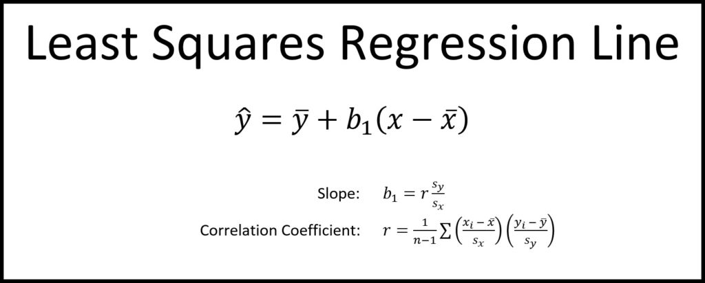
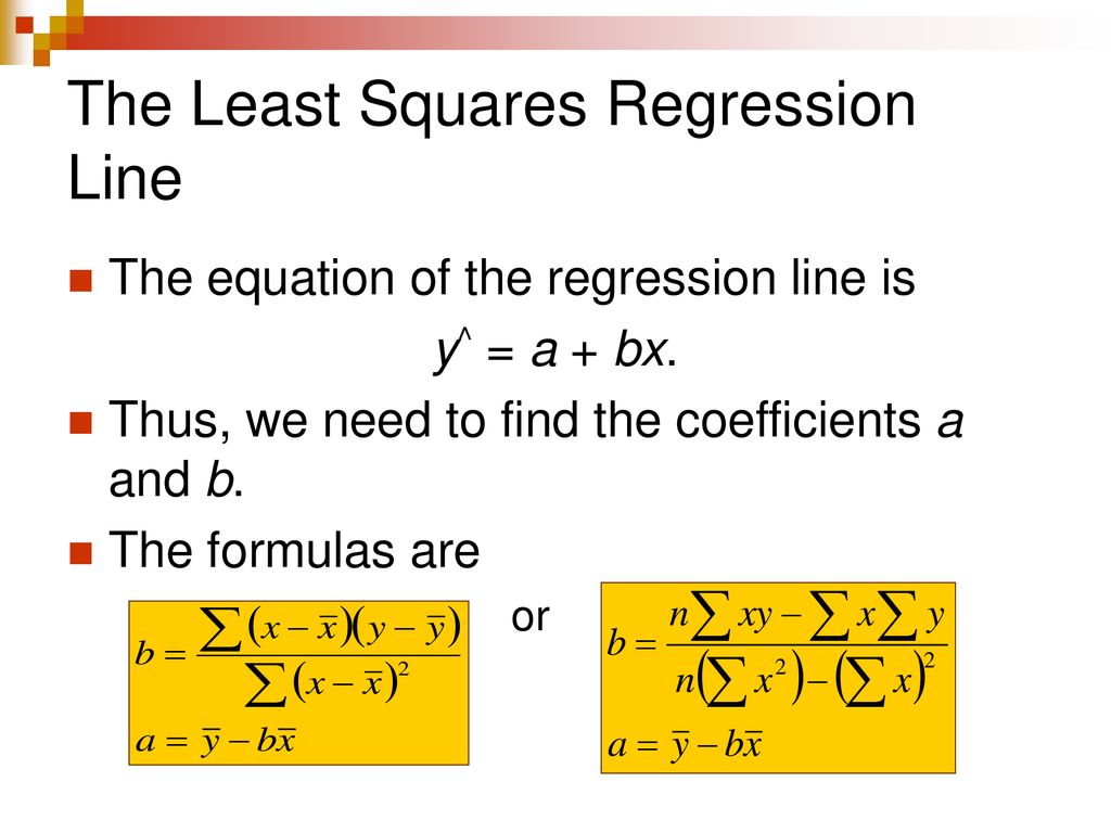
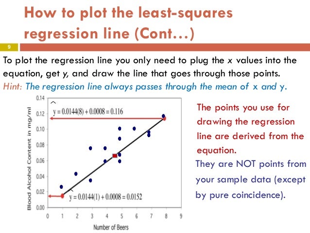
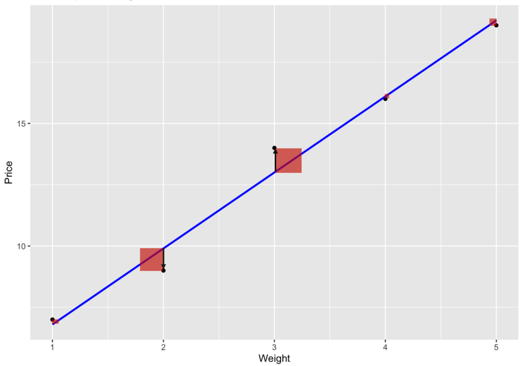
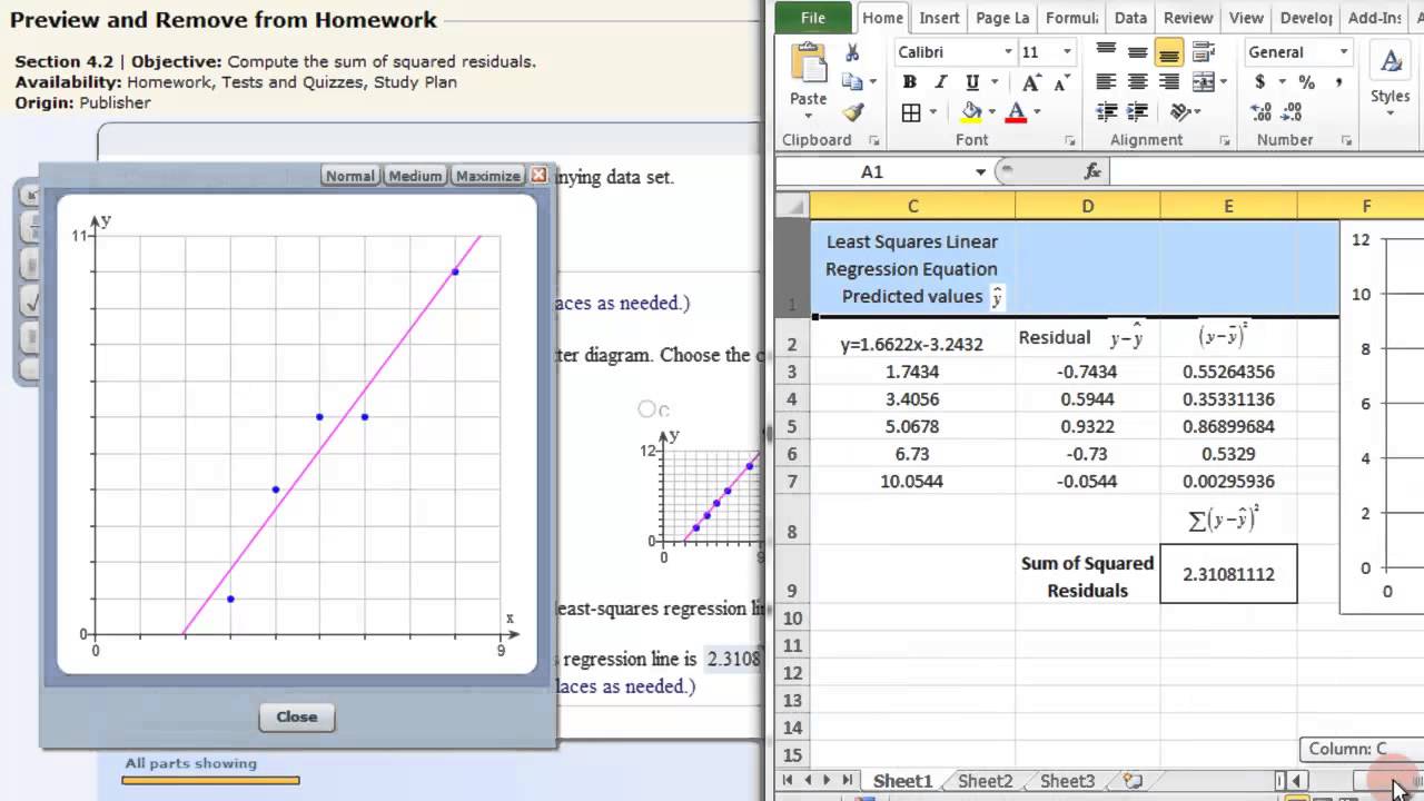
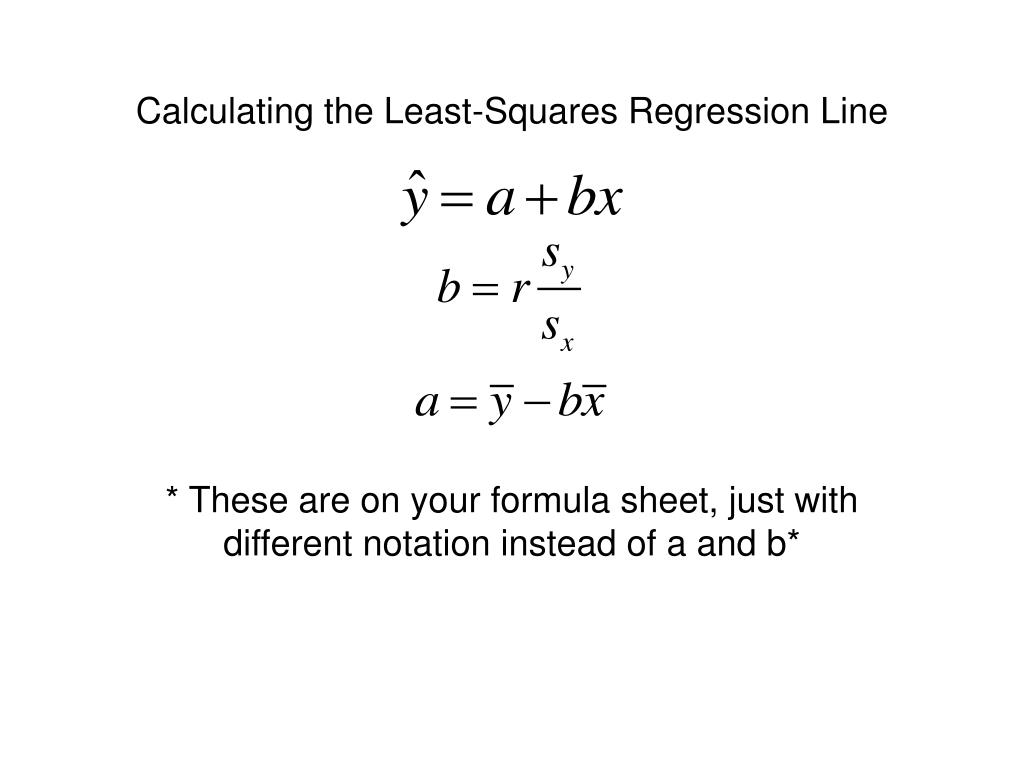
Fear not! There’s a magical "line of best fit" ready to be discovered. This is the famous least squares regression line. It's not about connecting the dots precisely but finding a general trend amidst the chaos.
StatCrunch to the Rescue!
First, fire up StatCrunch. Input your data, labeling one column "Ice Cream" and the other "Happiness" (or something equally delightful). Think of it as feeding your digital assistant all the clues.
Now, navigate to "Stat" -> "Regression" -> "Simple Linear". Sounds intimidating, but it's easier than ordering a complicated latte. You're telling StatCrunch you suspect a straight-line relationship between ice cream and joy.
Pointing the Finger (at Variables)
A dialog box pops up, demanding information. It's asking, "Which column contains the *X* values (the ice cream)? And which holds the *Y* values (the happiness)?" Assign accordingly, like choosing ingredients for a sandwich.
Before you click "Compute!", take a peek at the "Graphs" section. Ticking "Fitted line plot" is like asking StatCrunch to draw the suspected culprit over your scatterplot. It’s visual confirmation of the line’s potential guilt.
Eureka! The Line is Revealed!
Click "Compute!" and behold! A new window emerges, filled with numbers and statistical jargon. Don't panic! Our prime suspect is the equation tucked away in the output.
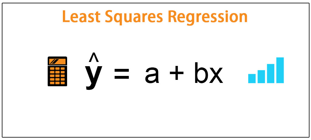
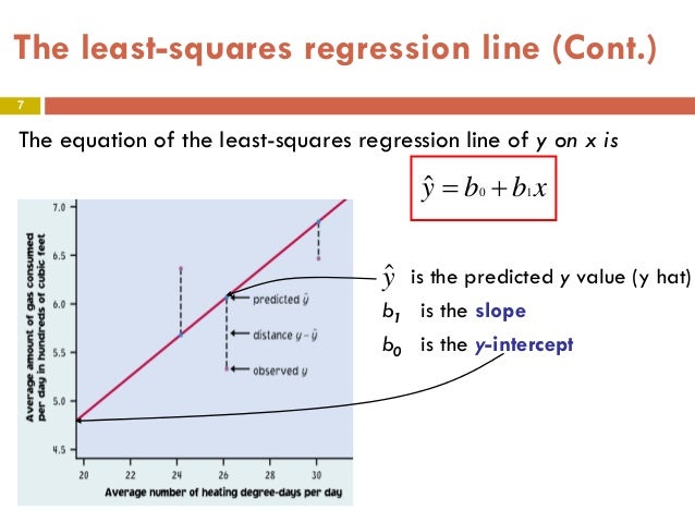
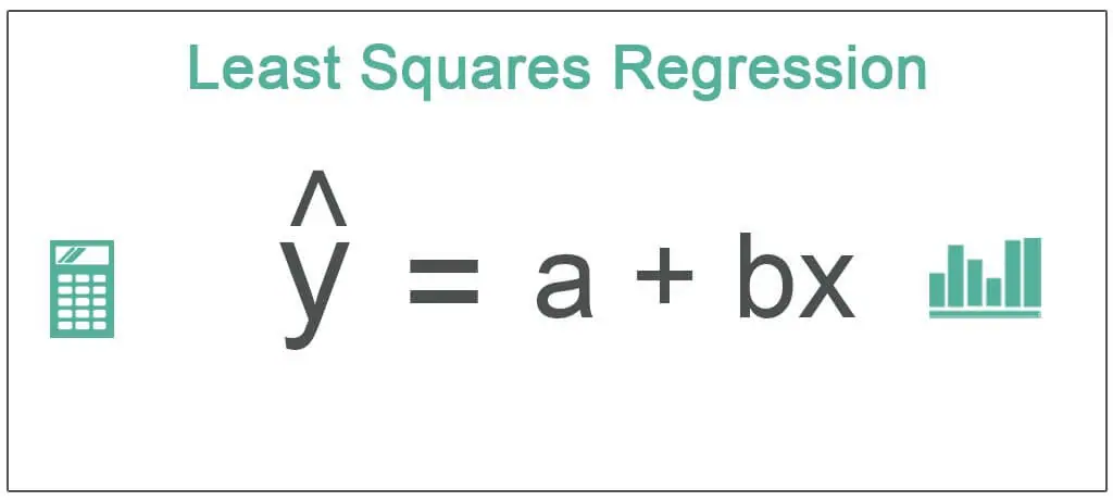
It will look something like this: Happiness = a + b(Ice Cream). The 'a' represents where the line intercepts the y-axis, also known as the y-intercept. The 'b' is the slope, telling you how much your happiness increases with each additional scoop of ice cream.
Interpreting the Evidence
So, if your equation says Happiness = 2 + 0.5(Ice Cream), that means you start at a happiness level of 2 (presumably baseline human contentment). And for every scoop, your happiness increases by 0.5 points. This is like discovering that chocolate chips are the key to happiness, not sprinkles.
But remember, correlation doesn't equal causation! Maybe happy people simply eat more ice cream. Perhaps there's a third, secret variable at play, like sunshine or winning the lottery.
Beyond Ice Cream: The Power of Prediction
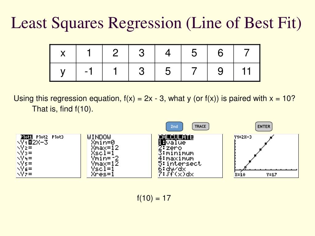
This line isn't just about ice cream and happiness. You can predict future outcomes based on new data. If you plan on eating 5 scoops tomorrow, plug "5" into the Ice Cream spot in the equation. Voila! StatCrunch predicts your happiness level. This is the fun part; the ability to predict based on the trend!
A Few Words of Caution
Be wary of extrapolating too far! Just because the line works for your data range doesn't mean it holds true for extreme values. Predicting your happiness after eating 100 scoops might lead to… unexpected results. Always be mindful of the limitations.
Closing the Case
So, there you have it! You've successfully used StatCrunch to find the least squares regression line, unearthing the hidden trend within your scatterplot. You are now armed with this statistical tool!
Now go forth, explore your data, and uncover the secrets hidden within the dots. Remember, behind every scatterplot lies a story waiting to be told. And with StatCrunch by your side, you're ready to write it! This helps show the relationship between the variable.

